Menu

Visualization, specifically a visual schedule, brings transparency and all your information to you quite literally in once glance. The addition of color, an intuitive part of any visual schedule, takes visualization to the next level by bringing an additional depth of intelligence.
The benefits of colors in visual scheduling are vast, almost to the point where one cannot think to have achieved the best schedule without the added support of color.
It's so basic, so fundamental, and so critical in so much of what we do that we often take it for granted. Yet color not only aesthetically enhances a visual schedule but yields the basis for understanding your visual schedule. This understanding brings with it unprecedented value in gaining transparency across your data, a transparency which results in greater agility and better informed decision-making.
The history of color in our lives is as detailed and rich as the unending colors themselves. The Smithsonian writes, "Already 350,000 years ago with ocher and manganese, our ancestors marked objects and possibly their own skin. Colors were symbols by which they identified themselves and their group."
 Though we've come a long way in 350,000 years, it's amazing how little has changed in how we use colors in helping us to identify and categorize.
From traffic lights to construction sites we use color as a way to organize our lives hundreds of times per day. However, this overarching value we see in color extends far beyond traffic lights. The correct application of colors in scheduling, for example, can be nothing short of miraculous when implemented correctly. Let's break it down.
Color can play a plethora of roles in your scheduling but this plethora of roles can be grouped into three major functions.
They help create a visually appealing schedule which includes easy to perceive contrasts as well as an easy to follow layout for the user's eyes. Without considering appearance you will not create an optimal schedule. A truth that will result in a lower quality of work.
As such, they help the users to faster understand the complete and often complex reality that a production schedule presents. Our eyes are trained to see certain colors in certain ways. Red usually means alert, danger or stop. Yellow stands for warning and green indicates a go ahead. Keeping with our already perceived notions of colors is hugely beneficial to optimizing color usage in your schedule.
If on-time bars on the schedule are normally blue and a red cross-hatching across the bars alerts you of delays then you can very quickly look for the areas on the schedule where red cross-hatching is know immediately that that is a delay. You can use this same color logic to define customer priorities or identify bottleneck machines in your production work flow; two examples we will look at more closely in the next section.
Understanding the immense value color can bring is certainly the first step towards using colors effectively for visual scheduling, however practically implementing colors into your schedule requires not only the ability to recognize the value colors will bring, but also the ability to recognize the correct amount of color in your schedule being careful to avoid over-coloring. In essence, this means being able to establish the where and when of using colors.
Too much color can create just as many problems as too little color!
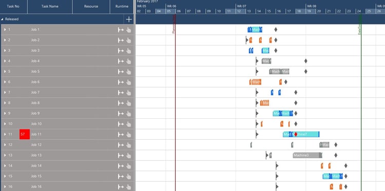
That being said, it's critical that you understand where and when you should implement certain colors to represent certain criteria. A good example is priorities of your jobs. Let's say you have customers categorized in groups of high, medium, and low importance. One effective way to implement colors in your visual schedule would be to assign each customer priority type a color. Let's say highs get blue, mediums orange, and lows gray. This way when viewing your jobs you will immediately know which job is which priority customer and see where that job's task falls in the schedule.

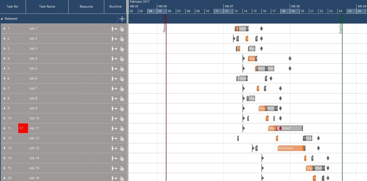
Another example comes in identifying bottlenecks in your production. Let's assume you have a bottleneck, occurring during in a given time frame, among your machines which is known. Highlighting all work which runs through that machine or machines will allow you to view all work running through the bottleneck easily. In this case let's turn all job tasks running through my bottleneck machine orange. This in turn will allow you to spend much less time identifying and much more time deciding how to optimize your schedule.

It means that color is not only beneficial to better scheduling but imperative. It also means that while color is imperative, it is also imperative to understand where and when color is most effective when creating your schedule. What is continually seen and proven, however, is that correct use of color makes a significant difference in the effectiveness of your scheduling processes.
just plan it makes using and applying your own color schemes as easy as defining what you want to see and in which color.
Try just plan it for free and see for yourself how much difference color makes.
Further Reading:
The "Color As" Feature - SMB Production Scheduling Blog
4 Options for Fighting Production Delays Due to Bottlenecks - SMB Production Scheduling Blog
just plan it is a production scheduling software plus scheduling tools & best practices to help high-mix low-volume make-to-order manufacturers gain transparency and control over their shop operations. The software plus its methodology is used by thousands of people around the globe. They consistently achieve improved on-time deliveries, shorter lead times, and better utilization of their resources.
As just plan it is not just software, but a lot of processes and best practices, we recommend that you start with an exploratory meeting. If we agree that there is a fit between your requirements and our approach, we'll build a prototype for you.
Hence, it all starts with a meeting. Book that meeting now.
These Stories on Scheduling Best Practices
Made with by BOYUM IT SOLUTIONS GmbH (Copyright © 2024) Read our Privacy Policy & Terms of Service
No Comments Yet
Let us know what you think