Menu


As you guys probably know: just plan it is provided by NETRONIC Software. And as NETRONIC is the worldwide leader of providing visual scheduling software to enable SMB organizations to achieve operational agility for more than 45 years now I felt the time was right to further strengthen the “visual” aspect of just plan it. What sounds quite trivial came along with a lot of development efforts (what the dev team called “the big stuff”) on one hand but – as a matter of fact – also with extraordinary and very beneficial functionality to further evolve the application on the other hand.
So, with this blog, I am very happy and proud to give you an overview of additional functionality we provide with the new December release version (that we finally published Dec. 15th at 10.35am german time) to all of our just plan it customers.
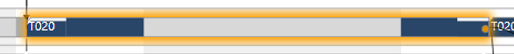
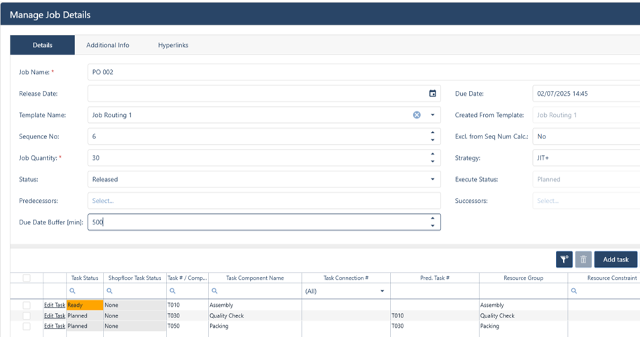
We have revised the way to visualize the tasks in the Gantt chart. In order to achieve a calmer overall picture with fewer colors, the areas of operations that fall during non-productive times are now kept in grey. Below you can see an example of a job routing in the job view.
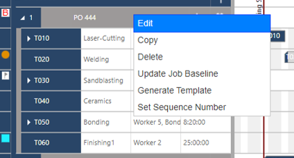
(To focus the attention of the user on the relevant information of the schedule we removed the icons to edit, copy and delete a job that formerly were placed in each job line of the job view. Now we integrated the related interaction into the right mouse menu (see screenshot below). This incidentally allows the user to insert and fully read longer job names in the job lines.
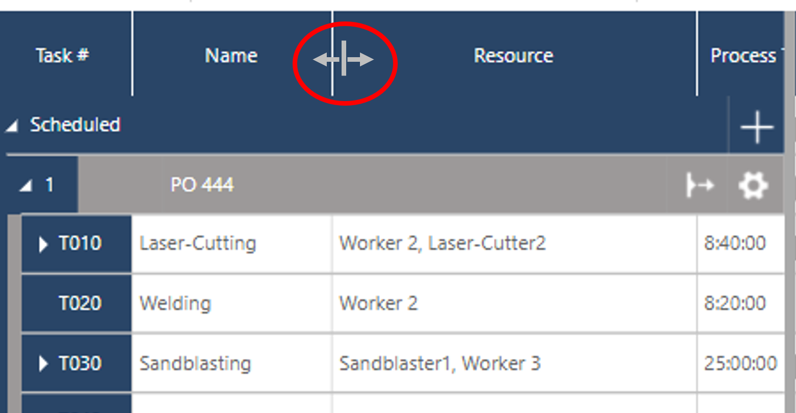
In this regard, we added another helpful option. With the new version, you are able to change the width of the table columns individually by dragging the splitters of the top line (see below). The setting is then saved so that you will start off with the same widths when reentering your account.
Ultimately we adjusted the visualization of setup and teardown times. When inserting such detailed times to a task you will now recognize it in the resource-centric views by bars that have a slightly lower height compared to process times. As this is less disruptive than the former triangular kind we removed the respective icon from the ribbon bar and keep this way activated always.
To get the best understanding of your schedule we both added very beneficial new symbols and reissued some of the symbols we use in just plan it since the very beginning:
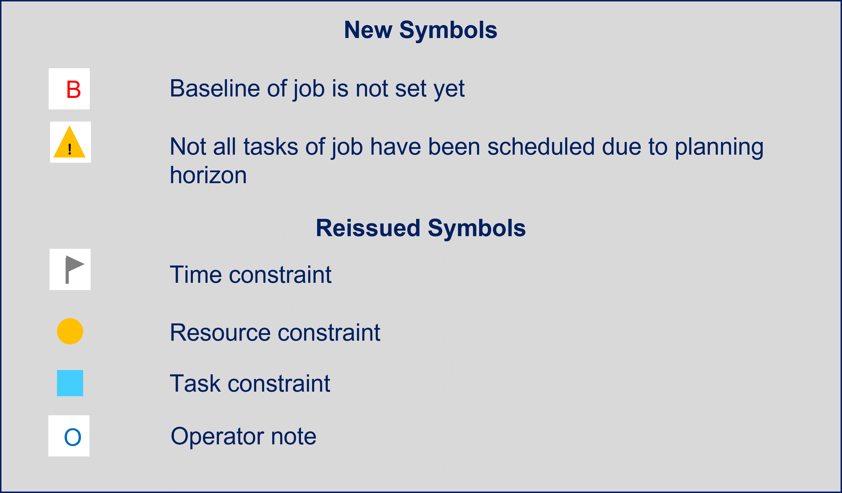
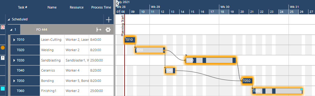
These symbols plus the ones that we kept unchanged you can find on the respective tasks in the Gantt charts as you are used to it. But furthermore, we added a new column to each view where you will see the symbols even within the table part at the very left. That makes it easier to understand your schedule at first glance. The example below shows the routing structure of a job in the job view that has
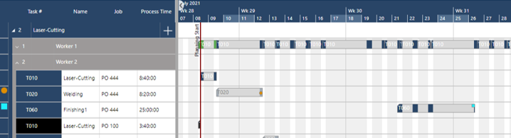
You see the task-related symbols also in the resource-centric views when expanding the related resource line in the table.
The same is also true for the symbols in the Gantt chart views of the Execute Tab. Here you will find the usual – execute module related – symbols in the same way.
Calendar exceptions have very important impacts on your schedule as they de- or increase your limited capacity. To make it easier to spot the related time windows in the Gantt charts we now provide the functionality to categorize and color calendar exceptions.
By default, there are five categories that you can select:
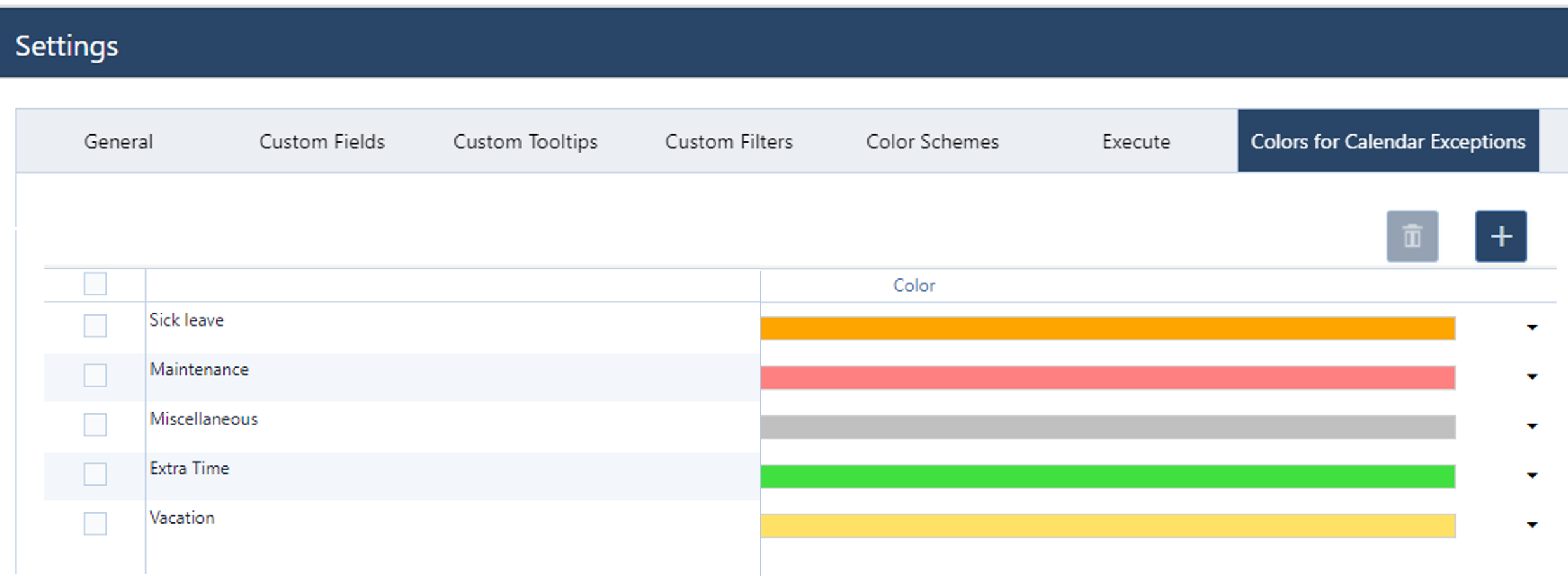
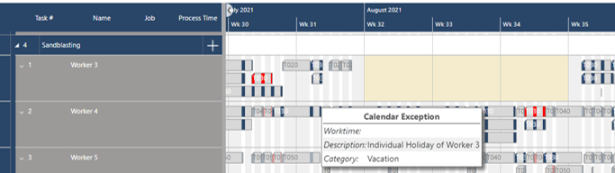
All these categories have a standard color. As a matter of fact, you can do both: add as many categories as you need and adjust the colors to your preference in the Settings dialogue (see screenshot above). In the calendar exceptions dialogues, you can then use the categories accordingly. After creating a calendar exception the respective time frame is then fully colored accordingly. The example below shows the resource group view with a 3 weeks vacation for “Worker 3”.
With this year's August release, we focused on easily updating mass data. As we got very good feedback afterward, we motivated ourselves to make it possible to visualize large data sets in a better way with less scrolling also. And here we present the “Compact Lines”. You find the respective icon in the Settings tab.
When activated the lines in the Gantt chart views are greatly narrowed. The screenshot below shows the job view with compact lines. Compared to the standard line setting you are able to see appr. double as many job lines. Try it out!
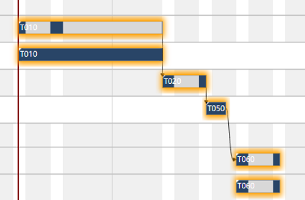
By adding a dedicated symbol for a “missing baseline” we wanted to underline the importance of the baseline functionality and force the usage. There is a great benefit of making a deviation analysis of planned and as-is values to enhance the input data quality. For this, I still recommend making a statistical analysis based on exports or making use of the respective functionality of our production excellence dashboard.
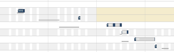
But that can only happen occasionally. What if I'm constantly keen to see how my current schedule goes against the baseline? Here you go: clicking on the respective “B” icon in the Settings tab the baselines of all tasks are visualized by grey underscores in the job view in addition to the currently scheduled tasks.
Zooming in and out of the timescale via mouse wheel is a killer feature of jpi since the first version of the software. But talking with our customers we learned that also zooming into a selected time frame is a function that is used regularly. Formerly we did not offer to zoom out again (except using the mouse wheel). With this release, we have closed this gap.
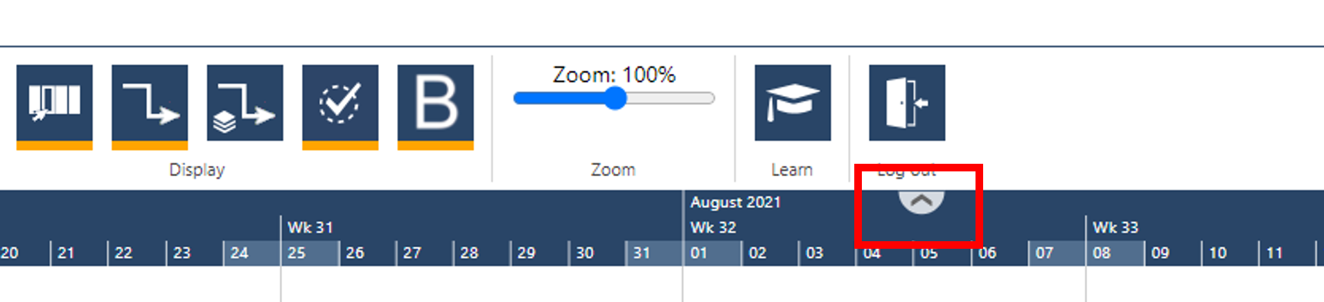
At the top of the timescale in each view, you find an icon (see above) that helps you to zoom out when clicking on it.
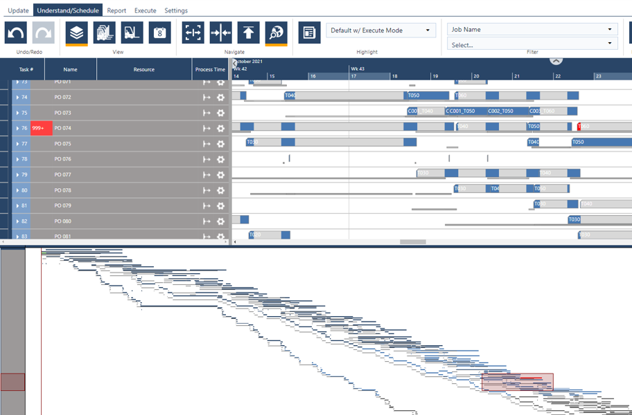
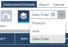
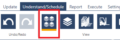
Navigating in and out of the timescale is important. But sometimes it would be good to have a quick overview into the entire schedule to quickly change focus from one to another aspect; e.g. from the job with the highest priority (“top-left”) to a late job with lower priority (“somewhere downright”). For this, we provide the world view. When clicking on the “globe” icon in Understand/Schedule tab the lower half of the screen will show a “world view” - or in other words the schedule in very small resolution (see below):

This world view has not only a visual purpose but with the cursor, you can quickly navigate to any position (in a vertical and horizontal meaning) in your schedule and the upper Gantt chart part will follow your movements live. Once you click anywhere outside the worldview the Gantt chart will fully stay with your navigation. Again: just try it out 😉
A worldview with a small resolution is great for navigation. But sometimes it can be also helpful to see the entire schedule – including details - in a sufficiently large resolution. We know this because customers and prospects ask us regularly if they/we can print Gantt charts. So far we have always negated this and referred (from my point of view for very good reasons!) to the extremely fast-changing nature of a schedule in a high-mix low-volume environment. Also, providing such functionality is a real heavyweight (or did you ever try to print out of your internet browser with sufficient results?!). But the customer is king. So, we proudly present the “exporting to pdf” functionality. With this you are (literally) able to export the Gantt charts on multiple pages into pdf, save it locally and print it from there.
Clicking on the printer icon in the Report tab you open the respective dialog to define your export:
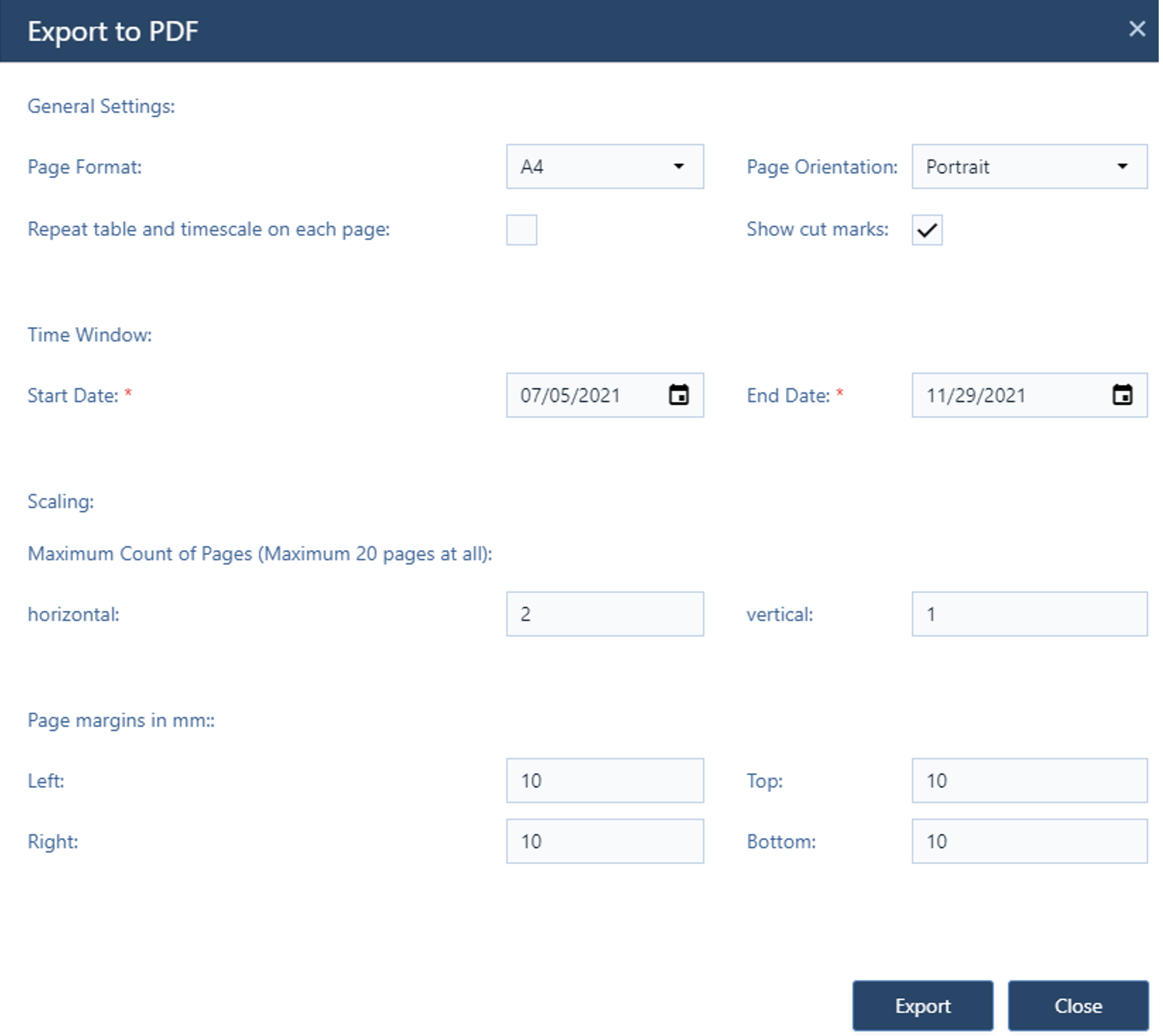
While the dialogue is pretty intuitive and quite following the structure you know from other solutions the crucial part here is the “Scaling”. You need to define the maximum amount of pages both horizontally and vertically. In this regard please note:
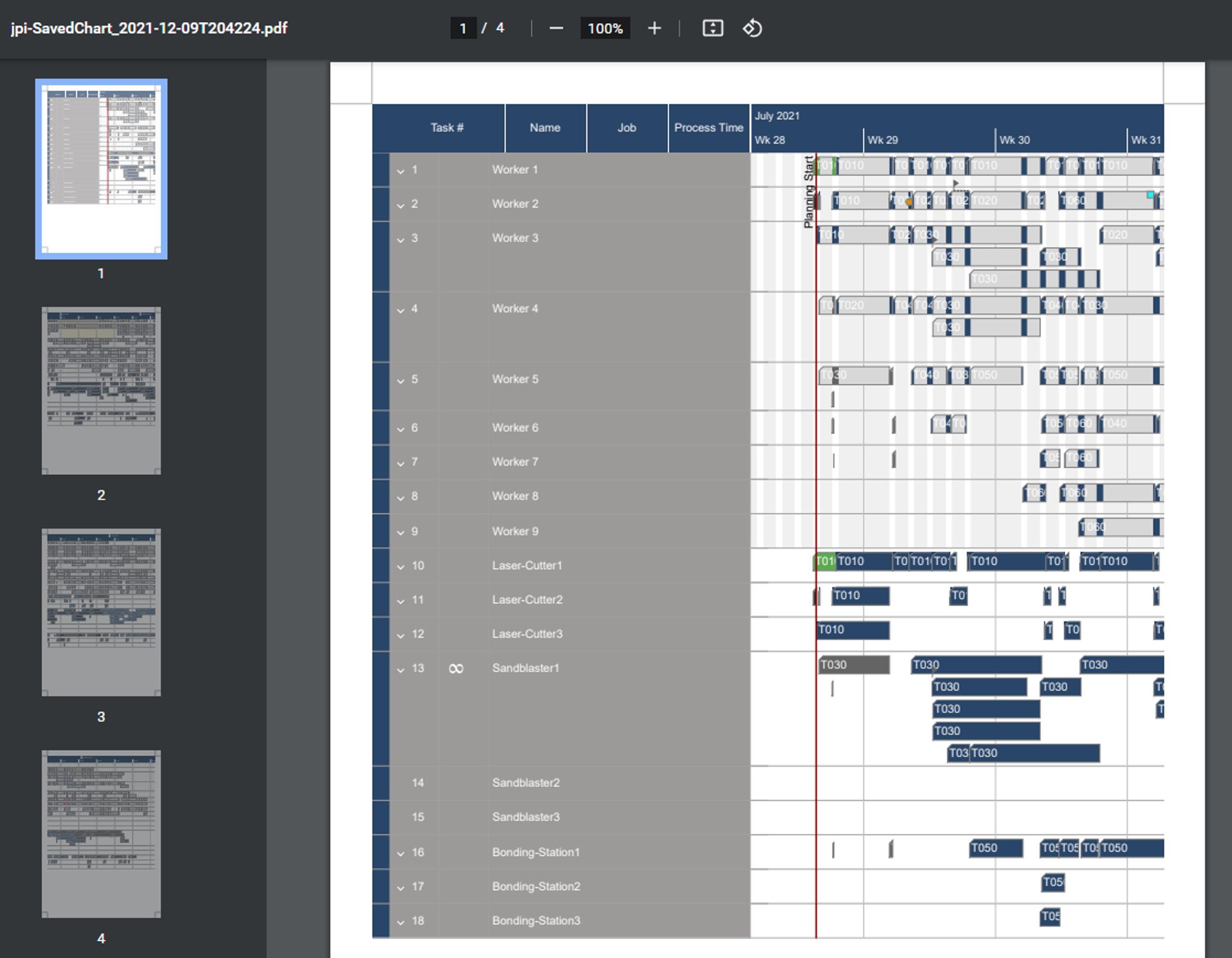
In my example, I exported the entire schedule shown in the resource view. Therefore I defined 1 max page vertical and 4 max pages horizontal using portrait orientation. I did not need to adjust the “Start Date” & “Ende Date” as the default value of the dialogue always starts from the planning start line and ends with the task that has the latest end date. Hence the default always focuses on the entire schedule. The resulting file you can see below. The single pages you can print and then easily stick together.
I think this is a very powerful functionality to save the different states of schedules over time. Also, it allows you to have a very good and complete insight into the plan at a time when particularly important decisions have to be made. Personally, I advise against printing out entire schedules at too short intervals. In my opinion, “the schedule” at any dedicated point of time is valid for far too short a period in your dynamic environment. So, use this functionality wisely 😉
That’s it for today and for this year. We are happy to close 2021 with such a blast. But already now we have a lot of requests and ideas to improve jpi even further in 2022. And we do look forward to it 😉 But now I wish you all a Merry Christmas, a good start into the coming year, and as always “Happy Scheduling!”.
just plan it is a production scheduling software plus scheduling tools & best practices to help high-mix low-volume make-to-order manufacturers gain transparency and control over their shop operations. The software plus its methodology is used by thousands of people around the globe. They consistently achieve improved on-time deliveries, shorter lead times, and better utilization of their resources.
As just plan it is not just software, but a lot of processes and best practices, we recommend that you start with an exploratory meeting. If we agree that there is a fit between your requirements and our approach, we'll build a prototype for you.
Hence, it all starts with a meeting. Book that meeting now.

No Comments Yet
Let us know what you think