Menu


This is the second post of a series about cool and useful color schemes that you can build yourself with our just plan it software. The idea of these color schemes is to help you identify critical issues faster and hence achieve an easy time and resource scheduling. The previous blog looked at customer-oriented color schemes, and this time I shed some light on which color schemes you can define to better see bottlenecks.
Waiting times are an interesting and important phenomenon in any job shop. Within just plan it, we
define the waiting time per job as total throughput time minus total non-working time minus total
runtime minus total transfer time. In essence, the waiting time tells you the total time (starting at
the planned start date) that this job has to wait due to other jobs having a higher priority.
Generally spoken, waiting time is not a bad thing. If you - literally! - look at this from the Resource
View (means from the perspective of your machines), it is the waiting time that helps achieving a
high utilization of your resources, with one task lining up after the other. If there is just waiting time,
it tells you that you seem to have a solid amount of orders to keep your resources busy.
However, if the waiting times become too long, jobs may run danger to finish late. Hence, it is recommended to keep an eye on the waiting times … and hence define a color scheme accordingly.
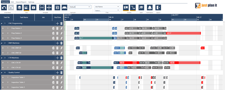
This is how the schedule looks with the applying the default color scheme. You see that basically
all resources seem to be comparably loaded with jobs and tasks.
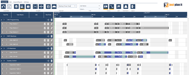
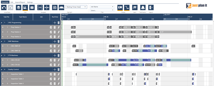
After applying a “Waiting Time View” color scheme, the same schedule can look like the below.
You might recognize that you have the most tasks impacted by waiting times lining up in resource
group CTX Machines, but that there also some jobs waiting in the resource group DMF Machines.
Here is how to get this color scheme going:
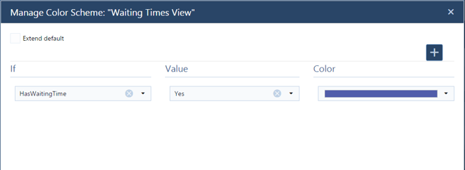
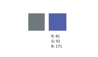
As “if parameter”, please select “HasWaitingTime” and then choose “yes” as the value. Now
you just need to pick a color for those jobs that have waiting times, and you are ready to go.
For the waiting time we recommend a slighter subtle color, as there are other priorities that
require a more immediate attention. This choice of color does not clash with those more vibrant,
needed to indicate area of focus.
This color scheme is closely related with the “Waiting Times View” color scheme and we highly recommend that you make yourself familiar with this color scheme before. As outlined when generally dealing with waiting times, they can become an issue if they cause jobs running late.
In that case, waiting time feels like “wasted time“ and then turns into an indication of a bottleneck
in your production flow. Hence, you should somehow focus those resource that process jobs with
waiting times that also run late. If there are resources in your shop that are needed to process jobs
with waiting times that run late, you have a clear indication that these resources are the bottlenecks
in your shop.
Let’s have a look.
This is how the schedule looks with the applying the color scheme “Waiting Time View”. You see
that you have the most tasks impacted by waiting times lining up in resource group CTX Machines,
but that there also some jobs waiting in the resource group DMF Machines.
Now I apply a new color scheme to the schedule. This time, the color scheme highlights jobs with
waiting time (purple) and jobs with waiting time and running late (orange). Here is how this looks
like:

You can clearly see that you have an issue in the resource group “CTX Machines” as the waiting
times in the other resource groups do not cause that huge amount of delays.
Here is how to get this color scheme going:
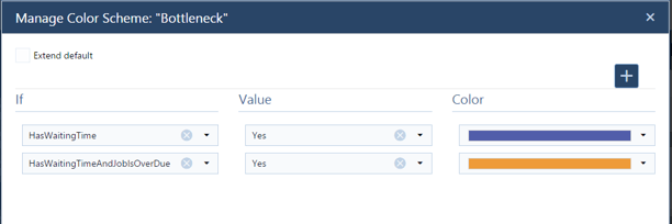
Now you need to use two parameters and assign the colors accordingly: Go for
• HasWaitingTime and
• HasWaitingTimeAndJobIsOverDue
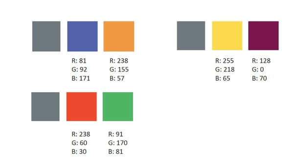
As you need to clearly differenciate both segments, the best way to visually enhance them is
by pairing complementary colors together. Here are a few examples:
Interesting in learning more about color schemes? Good news is that I wrote an Ebook in which I compiled 8 cool color schemes to improve yolur job shop scheduling. Download it now for free:


just plan it is a production scheduling software plus scheduling tools & best practices to help high-mix low-volume make-to-order manufacturers gain transparency and control over their shop operations. The software plus its methodology is used by thousands of people around the globe. They consistently achieve improved on-time deliveries, shorter lead times, and better utilization of their resources.
As just plan it is not just software, but a lot of processes and best practices, we recommend that you start with an exploratory meeting. If we agree that there is a fit between your requirements and our approach, we'll build a prototype for you.
Hence, it all starts with a meeting. Book that meeting now.


No Comments Yet
Let us know what you think