Menu


Our job shop scheduling software just plan it gives you the ability to create as many color schemes as you like. I sense that these color schemes can be truly helpful when trying to figure out certain situations on your shop floor faster. However, I also have the impression that color schemes are kind of "hidden champions" within the feature spectrum of our job shop scheduling software. Hence, I decided to kick off a blog series in which I share with you a couple of color schemes that really can help you improving your job shop scheduling. This first post within this series deals with customer-oriented color schemes. I will always discuss
Sometimes you have a situation, in which two jobs compete for the same resources and you have to accept that one job will be completed past the due date. In case you do not want to temporarily increase your capacity, you have to make the hard decision, which job you will make in time and for which job you have to live with a delay.
I am sure that there are hundreds of rules that are applied to deal with such a situation and to make the best decision. However, one common rule is that not all customers are equal. In case that one of the two critical jobs is for your one and only no1 customer, you want to make 100% sure that this job will not finish late.
It might be a bit cumbersome to look for the (key) customer’s name in the info window that pops up when your mouse hovers over a job. So, you better create a color scheme to highlight all jobs for your key customer.
Here is how your schedule might look like with the default color scheme. Basically, you need to make the decision if Job 5 or Job 7 should run late. 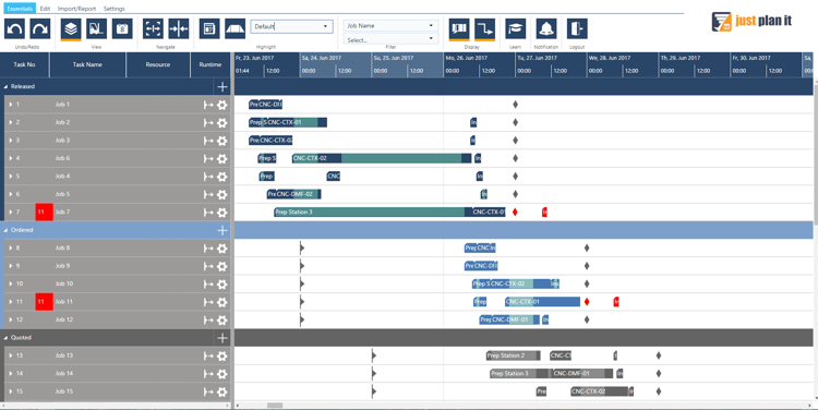
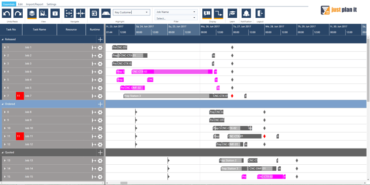
After applying a “key customer” color scheme, the same schedule can look like this. You see that it is good to get Job 5 done in time as it is a key customer job.
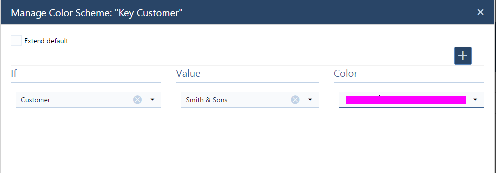
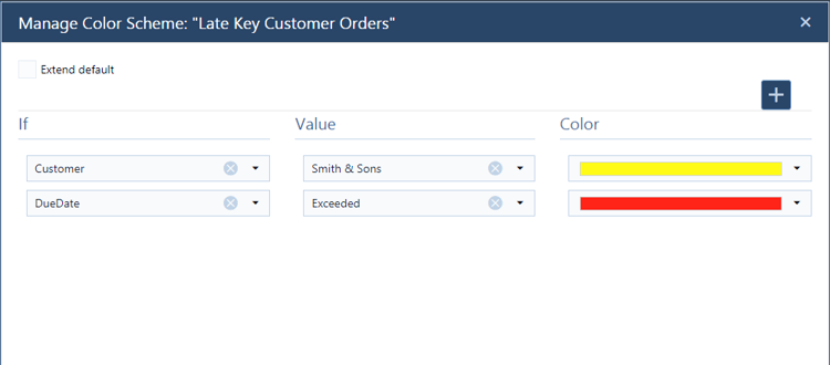
This color scheme is meant to highlight jobs from just one customer. That means you need to select “customer” as the filtering property, select your key customer as value (here: “Smith & Sons”) and then choose a color.
As grey is a combination of black and white thus, not a color in the theoretical term of the word (black and white are not considered colors; white is light and black is the absence of color), any bright color will stand out placed near it.
The best way to ensure a color stands out is by using primary colors. Primary colors are the ones which exist by themselves as they are. They cannot be created by mixing hues; therefore when placed by a grey color, the eye fully catches them.
There might be cases that a color scheme by one or a few named customers does not do the job for you: e.g. if you have too many important customers that you do not want to fiddle around with too
many colors.
Chances are high that you tend to think and act in customer segments, e.g. differentiating Tier 1 and Tier 2 customers from all the others. So if you want to gain a quick overview how you are doing with your Tier 1 and Tier 2 orders compared to the rest, you should build a color scheme accordingly.
Again, such an overview will quickly guide you to any issue in your plan – e.g. if a Tier 1 order runs late while an ordinary order will be ending in time, using the same resource that the Tier 1 order would also require.
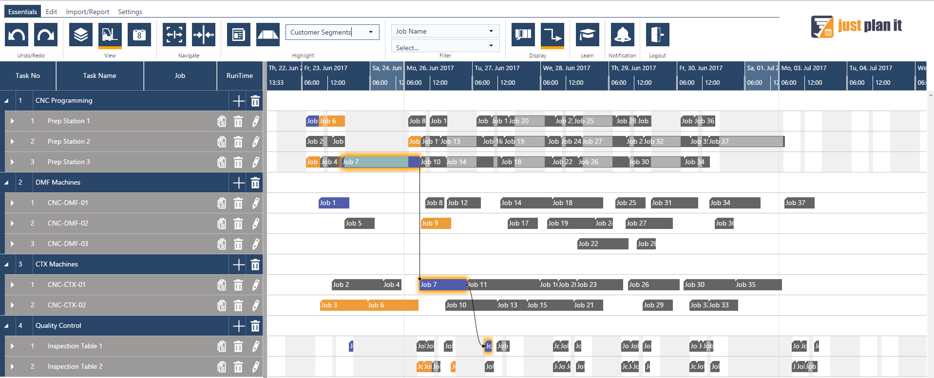
Here is how your schedule might look like with the default color scheme. You see that Job 7 runs late, but miss any contextual information in terms of the customer tier.
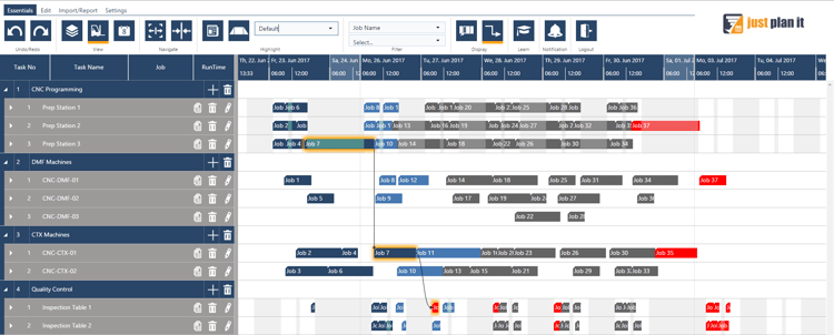
After applying a “customer segment” color scheme, the same schedule can look like this. You see that Job 7 is a Tier 1 job, and that it has to wait for two ordinary jobs before it starts. This is your call to action!

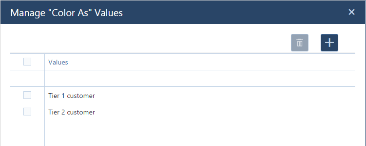
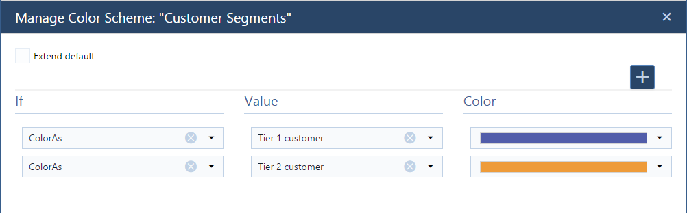
This color scheme is meant to highlight jobs from Tier 1 (purple) and Tier 2 (orange) customers. As customer tiers are no default values in just plan it, you first have to define them as so called “color as” values.
After that, you can define the respective color scheme “customer segment” by selecting “color as” as filtering property (individually for each tier”, selecting the respective tier as value and then choose a suitable color.
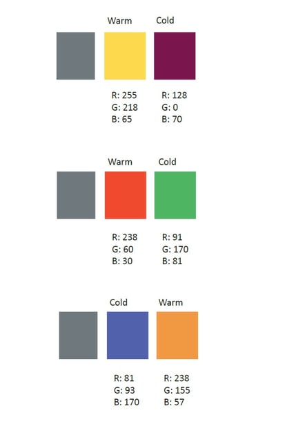
When facing the task of picking two colors the choice is rather simple. Complementary colors. That one tone that is going to contrast making both colors easily visible. They act as opposites, setting an aesthetical balance and making sure the eye cannot miss them.
Another option is choosing a warm color and a cold color, but this again, falls into the complementary color paradigm.
Here are a few examples that work well when combined together. They are complementary and belong to the warm and cold range:
This color scheme is an extension to the “key customer” color scheme. In addition to giving all tasks of a key customer order a custom color, it allows you to still use an alerting color for all tasks that end after the job’s date. That way, you can see at one glance if any orders for your beloved no1 customer run late.
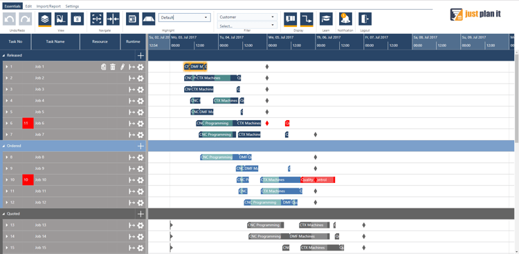
This is how the schedule looks with the applying the default color scheme. You see that Job 7 runs late, but you do not have a contextual information with respect to your key customer.
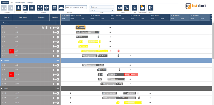
After applying a “late key customer orders” color scheme, the same schedule can look like the below. You still see that Job 7 is late (last task is colored red), but you now also see that this Job 7 is for your no1 customer (all other tasks colored in yellow).
Here is how to get this color scheme going:
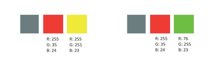
First of all, we recommend using a warning color for late jobs. As red is the international color code for warning, our suggestion is that the color choice falls along that range. We also recommend that the next color choice makes a contrast with that red, otherwise the visual
understanding might not be immediate.
However, if your intention is to create a state of awareness, we recommend saturated colors, as they will be hard to miss.
Interesting in learning more about color schemes? Good news is that I wrote an Ebook in which I compiled 8 cool color schemes to improve yolur job shop scheduling. Download it now for free:

just plan it is a production scheduling software plus scheduling tools & best practices to help high-mix low-volume make-to-order manufacturers gain transparency and control over their shop operations. The software plus its methodology is used by thousands of people around the globe. They consistently achieve improved on-time deliveries, shorter lead times, and better utilization of their resources.
As just plan it is not just software, but a lot of processes and best practices, we recommend that you start with an exploratory meeting. If we agree that there is a fit between your requirements and our approach, we'll build a prototype for you.
Hence, it all starts with a meeting. Book that meeting now.


No Comments Yet
Let us know what you think